Wednesday, May 23, 2018

End of Year Reflection


Human Faces
Our goal for this project was to create a company based on factors that other people in our class decided for us, and I created a primate sanctuary from it. It took a few months to make, and I had a bit of a hard time figuring out what I would use for my logo, but after that it was a pretty smooth ride. People loved one logo that looked like both a monkey and a human, so that was what I used. I really like how it turned out. However, I had to learn a lot about using Photoshop to edit the lighting of a picture, since I had to use it to put monkeys in a picture.

Magazine Spread
For this project, we had to interview a local illustrator/graphic designer/etc and learn about their job; my interviewee's name was Madison Crabtree. It took a long time to finish, considering I had never made a magazine spread before, and the server crashed in the middle of making it. I almost had to start all over! I learned a lot about spacing in this project and how to make a magazine spread "my own." There was one page that didn't really fit in with the rest in terms of color, and that was one thing people didn't like, but I changed it. I think it turned out pretty well, even though I later realized that I made a couple mistakes long after I posted it to Bēhance.

Prom
The Junior Committee at our school wanted us to create poster and ticket designs for prom, which was 1920's themed. It only took (I think) a couple weeks to do, and I had lots of difficulties trying to figure out what my design would even look like. During this process, I learned how to use the mesh tool in Illustrator! That was exciting for me. My classmates only got to see the version I made before I switched concepts, and they didn't really like it, but then again neither did I. Even though the committee didn't choose my design, I still like how it turned out! It's a bit simple, but still nice.

Eyed Tattoo
We started working on this project at the very beginning of the quarter, and just finished it a couple days ago! We had a free choice to pick whatever sort of company we wanted to and design a logo, poster, etc for it; I chose a tattoo parlor and named it EYED TATTOO. I think the biggest difficulty I had was in the beginning, when I couldn't even think about the specifics of my logo; I thought a squid logo would be neat, but I also liked the concept of a skull. Thankfully, my classmates really liked what I was doing with it, especially the fact that I gave detailed backstory to the founders. I ended up changing the entire concept of the infographic we were supposed to make, creating a safety poster instead of my original plan of a flow chart. My favorite thing about this was definitely the color scheme, and I thought it was really fun to make, but I think I could have done a better job on the billboard and web ads.

Time Spent in Class
I admit I have gotten pretty distracted during class, but for the most part I think I've done really well! At the very least, I tried to stay on task :>. If I didn't have any specific work I needed to be doing, I would usually be messing around on Illustrator trying to create a new drawing or something like that. I enjoy doing this at home too, but I don't always have the time for it, so sometimes I'll just doodle on regular paper if I don't have the time.

Strengths
I love (but also kind of hate) how detailed I make my work; I don't want anyone to be disappointed with how little I have, so I try to add a lot while trying to make sure I'm not adding too much. In order to make this happen, I sometimes work at home to finish something up if I'm sure that I won't have time to finish it in class.

Improvements
I take a really long time to finish my work, and that's not just in this class. It's not that I'm getting distracted (though that does happen sometimes), but just that I don't want anything to look sloppy. That can sometimes make me late when turning things in, but, even though I'm kind of busy outside of school, I try to work on big projects like these outside of school if I don't think I'll have enough in school (I know I just said this, but that's just me).

To Summarize the Semester...
I really like how laid back this semester has been, but I miss Burdolski. The sub was nice, but it's not often you have a long term sub, and it can be a bit tough. However, I think we've gotten closer as a class and have gotten better at critiquing each other without being outright rude. I have definitely learned from this semester that some projects take a reallyyyyyy long time to finish, but just because you're tired of it doesn't mean you can just slack off. Next semester—or should I say school year—I would like to get be able to make friends with the incoming juniors and give them valuable feedback, and I hope they will do the same for me.


- Brenna (• ◡•)

Monday, December 18, 2017

Semester One Final - Graphic Design

What We Did During the Semester

Adding Personality to My Name

For this project, our goal was to think about what made ourselves unique (hobbies, interests, etc.) and to write our names twelve different times, incorporating one of these interests into each twelve. We were only allowed to use type in this project, no graphics.
Overall, this process took about a month in all, from sketching out our ideas to uploading them to Behance.
There were some roadblocks along the way, especially when it came to the part where I wanted to put something travel-related into my name; there weren't very many things I could think of that had to do with travel other than postcards (which, when I put into effect, looked only vaguely recognizable) and landmarks. I settled on landmarks, as that ended up being the only thing you would really think about when it came to travel.


I ended up learning in the end that, even though we were only doing black-and-white versions of these, which color you set as the background does matter. I used a black background for the one with my name as a constellation, which made sense, but I did the same with ones that didn't need black backgrounds, like writing to my pen pals.
Most of the feedback I got on this project was very positive, that it looked very nice and clean. There were a couple, though, that needed to be changed a little bit; for example, the "B" in the one I had for reading looked more like an "o" for the first time that I had made it, so I had to change that to make it look more recognizable. I was also told that I should change the one for traveling since it's graphic based, but then I would have had nothing making up the words.
Other than the mistake I made with the black backgrounds, I think it turned out very nicely, and it was also a very fun project to do! I'm pretty selfish and like to talk about myself, so it was nice to be able to do that with no judgement haha.

Holiday Card

Our goal for this project was to create a holiday card (any holiday, even National Donut Day, which is what I did!) that was, again, type based, but we had to do it mostly by hand; we could only use the computer for fine-tuning our work, but it couldn't be too much.
This project, once more, took another month to do, but most of it was the sketching part. I did mine a little

differently: I created my layout, then got an actual donut and sprinkles and shaped them into what I wanted for the card, which took some extra time to do before and after school.
Right off the bat, I messed up, thinking that we could just make a sketch and upload it into the computer to edit; most of my editing was in Illustrator, but the main thing about this project was to get all the details done on paper. For this card, I was going to do Pride Month, but since I messed up so bad, I changed my mind and decided to do National Donut Day instead.
During this project, I learned that it really takes a lot of work to be able to do hand typography well, and that even when you think something is done, it's not. Photoshop also helped me to learn that lighting is always very important when it comes to holiday cards with photos on them.
The feedback I got on my sketch was pretty well, but I got a lot of criticism for the photos I took of the donut. The lighting was always too bright/dark, the kerning of the sprinkle letters was off, but overall people liked it!
About midway through this was when Mrs. Burdolski helped me to decide that photos, instead of vectors, would be better and way cooler looking. This was pretty much the only thing that really changed about my project, other than that first failure.
I think, other than the fact that I forgot to fix the kerning and some of the lighting, that this project went really well. I could have been a lot more attentive when it came to details like the ones mentioned above, but, to me, it seems like something that would actually show up at Hallmark.

Company Branding

At the very beginning of this project, we had to write down any animal, any number, any mineral, and any two-letter combination. We then put all of these slips of paper in specific jars, and went around the room picking up random animals, numbers, minerals, and letter combos (I had a monkey, 420, iron, and AB). We then had to create a company that integrated all of these things into it, along with a logo, product, uniform, app thumbnail, interior, exterior, and stationary for that company. I ended up creating Human Faces, a primate sanctuary based in Amtali, Bangladesh, with its address being 420 Iron Drive.
This project took about two months to complete in all, having to create logo sketches and many layouts for all of the things above and uploading all of it to Behance.
The biggest challenge here, as I'm gonna keep talking about, was that it went on for so long and I was getting impatient and lazy with it. For as long as this project went on for, I learned that it's really crucial to not get lazy with what you're doing, even if it lasts a while. I constantly had to keep pushing myself to stay with the game and not let my work get sloppy.
I was proud of the feedback I got on this project, and especially so when it came to the logo sketches. I wasn't even really thinking about it when I made it, but the group I was with noticed that one of the logos I made looked like both a monkey and the profile of a person, so we were all freaking out about that (of course I chose that one lol).
There were only a few things that I ended up changing with this project, and they only really had to do with the stationary. All I really needed to do was add a little border to the envelope and letterhead to make it look really "organic." I also had to remove the lines I originally had on my letterhead, but that was no problem.
I really don't like how long it took to do this project; it seemed to drag on for forever. However, I think that all that time allowed me to really get picky about my project, which is what I like to do. I feel like my logo and the idea I came up with for my company were kind of boring, but I'm still happy about how things turned out.

Time in Class

Most of the time, I thought I was pretty productive. I would sometimes get distracted watching videos or looking up that weird theory that people have about Avril Lavigne, but I got just about everything done on time (I get very stressed if I don't).
If I got done with something early in class or had nothing really specific to work on [that was graphic design related], I would usually work on the t-shirt project for Girls Who Code Club or try to get caught up on my outside vector portrait of Academy Award nominee Rooney Mara. I also wanted to learn how to do shading in Illustrator, so I did a bit of research on that, too.
Illustrator is a lot of fun to work with, so sometimes at home I like to mess around with it and see what kinds of things it has, and if there's something there that I haven't learned (but would like to) yet.

Strengths

I'm very detail-oriented when it comes to design, so I try my best to not make anything look poorly made. I also often try to see if there's any variations I could do on some portions of my projects to make them look better.

Improvements

Unfortunately, being detail-oriented is also a bad thing, since it makes my design process very slow. I have been a very slow worker my whole life, so I think that in order to get better as a designer, I need to learn to work faster without sacrificing the beauty in my project.

Summary

I really love being able to have graphic design for two whole hours!! Even though it's a bit of a stressful work environment, I'd still rather be designing something than taking notes in other classes (the way the room looks also helps, along with being able to sit next to my girlfriend ◕‿◕✿).
Of course, if I could change how fast things go in this class and some of the projects we work on, I would, but I don't think that's gonna happen anytime soon haha. I know we're being prepared for the graphic design world, but I just really like being able to work on projects like the ones I work on outside of class.
Most of what I learned this semester had to do with time management, as I'm a pretty slow worker, and really had to keep things going in order to keep up with people (but not the Kardashians).
Next semester, I would like to not be as easily distractible, as it happens a lot. Also, again, I would like to teach myself to be a faster (but not lazier) worker.
Lastly, even though this has nothing to do with what I'm talking about, I'd like to thank Mrs. Burdolski for being such a great teacher (I'm totally not trying to suck up)!!


- Brenna (• ◡•)

Tuesday, May 23, 2017

End of Year Reflection - Graphic Design

A Year in Graphic Design Before this year, I knew nothing about graphic design, other than a brief unit over it in 8th grade art class. I didn't know how to use Illustrator until this year, but after a while, it became relatively simple and fun to use. We didn't really use Illustrator to collaborate much; we have, however, had small-group critiques to help each other make our work better, and even had a partner for that reason in an earlier project. I often didn't speak during them (which I should've), but in return also received little feedback. We needed those critiques to communicate ideas to other people, like how the logo project conveys the standards of the company we chose. Most often, we had time to finish our projects and get everything lookin' neat, but it was a lot of work, and I often found myself falling behind. Like I said in my earlier post from animation, I have really learned how to manage my time this year, despite being a slow worker in everything I do. Thankfully, no group-work was involved in this class, so I didn't have to take leadership in anything (I'm horrible at being the boss).


Improvements...and Other Things
Again, I really think I've learned to manage my time well (in this particular area and animation, but not much else). Also, going from not knowing anything about Illustrator to being (almost, but not really) a pro when it comes to using it is a big jump, I think. But...I could really work on my Photoshop skills more; they're awful. I'll be needing to improve that if I want to stay in the sub-strand that designs logos.

But What Are You Gonna Do With Everything You've Learned?
I will definitely use Illustrator outside of school. I already have it at home, and I'm currently trying to figure out how to make polygonal vectors through tutorials. I have also tried a second logo redesign at home, this time for The Celtic Ranch.

If I Could Go Back in Time
Even though I really, really hated this project, I wish I made my slides for the Wolfgang Weingart project prettier and more informational. I also dislike(d) having to use specific color palettes in the quote project; there were some I thought would look better with ones I had picked out instead of a color wheel.

The End :>
I'm very excited for next school year, since graphic design is the e-Comm strand I'm going into. I can't wait to see all the projects we'll be doing, and how they'll differentiate with each other.


- Brenna (• ◡•)

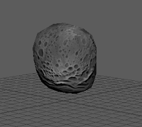
How to Make an Asteroid in Maya


Why Do I Need to Know How to Make an Asteroid?
Just in case you ever want to recreate the legendary "Godzilla Goes to McDonald's" (or if you just want to make a space scene). You do you. This tutorial is for anyone who's interested in learning about Maya, or just confused about a few functions of it.

Just Follow These Steps
1.) Open Maya
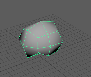
2.) Create a cube


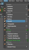
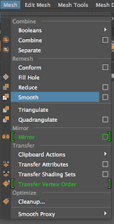
3.) Make it smoooooooth (Mesh>Smooth)


4.) Smoosh it in wherever (Surfaces>Sculpt Geometry Tool)


5.) Make it smoooooooth again


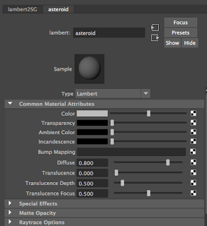
6.) Add a Lambert to it (hold down right button on mouse>Add Favorite Material>Lambert>maybe name it "asteroid")


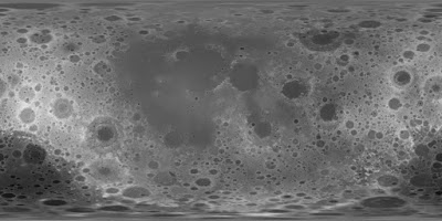
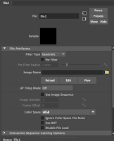
7.) Click the checker-lookin' button next to "color", choose file, then choose the stretched out asteroid picture up there at the top ↑.


8.) Lastly, add a bump map in the "asteroid" lambert attribute area where it says "bump map". Use the checker box next to it, and use the same stretched out asteroid picture up there. You can edit how deep the bumps go if you want. :>


More Help


- Brenna (• ◡•)


End of Year Reflection - Animation

What I've Learned
During this year in animation, I've learned a lot of valuable information, and actually got to like it more and more by the end of the year. However, I think the most important thing I've learned is to manage my time well. There's a lot to do in this class, and a lot of times, you don't have much time to do it. I'm a naturally slow worker, but I eventually learned that I could cut back on a few things to make sure I have enough time to do whatever I need to do. In other news...I also learned how to use Maya and After Effects pretty well thanks to all the direction sheets, even if those programs seemed to hate me at the beginning of the school year. Speaking of the end of the school year, I'm very happy about the way my group project worked out, even if no one told me that the storyboard was being changed (we could have worked on communication more haha). But, everyone did their jobs, so that was good. Thank god I wasn't the leader in that group, but then again, I wasn't the leader in any other group project. I would have done horribly in that aspect.

You're Doing Well/Work Harder
I really think that managing my time has become my best skill in this class, but I think I still might need to work on putting extra effort into my projects. Sometimes I just do the bare minimum because I'm stressed out about time when I actually do have time to make it look better.

Outside of School
I wish I could get Maya at home so I can work on personal projects, but it's just too expensive (the amount it's asking for is more than I've ever had at one time, and I actually save my money). However, now that After Effects no longer hates me, I think I might experiment with that a little more at home and maybe make some of my own animations.

But What Will I Do With All the Things I Learned?
Again, I think I'll work at home on some personal projects, but maybe I'll use some of my animation skills when it comes to graphic design, since that is the e-Comm class I have chosen to go into as a junior.

Change the Past
I REALLY WISH I COULD HAVE GOTTEN AN A LAST SEMESTER!!! That stressed me out so much. I really wish I worked harder. That's really the only thing I wish I could change.

The End...
This has been a pretty great class to be in, considering I've learned so much and that Mr. Netterville is pretty funny. I enjoy animation, and maybe I'll take some animation courses in college, but that's a long time from now. I hope I can learn more about it in the years to come!


- Brenna (• ◡•)