What We Did During the Semester
Adding Personality to My Name
 For this project, our goal was to think about what made ourselves unique (hobbies, interests, etc.) and to write our names twelve different times, incorporating one of these interests into each twelve. We were only allowed to use type in this project, no graphics.
Overall, this process took about a month in all, from sketching out our ideas to uploading them to Behance.
There were some roadblocks along the way, especially when it came to the part where I wanted to put something travel-related into my name; there weren't very many things I could think of that had to do with travel other than postcards (which, when I put into effect, looked only vaguely recognizable) and landmarks. I settled on landmarks, as that ended up being the only thing you would really think about when it came to travel.
I ended up learning in the end that, even though we were only doing black-and-white versions of these, which color you set as the background does matter. I used a black background for the one with my name as a constellation, which made sense, but I did the same with ones that didn't need black backgrounds, like writing to my pen pals.
Most of the feedback I got on this project was very positive, that it looked very nice and clean. There were a couple, though, that needed to be changed a little bit; for example, the "B" in the one I had for reading looked more like an "o" for the first time that I had made it, so I had to change that to make it look more recognizable. I was also told that I should change the one for traveling since it's graphic based, but then I would have had nothing making up the words.
Other than the mistake I made with the black backgrounds, I think it turned out very nicely, and it was also a very fun project to do! I'm pretty selfish and like to talk about myself, so it was nice to be able to do that with no judgement haha.
Holiday Card
 Our goal for this project was to create a holiday card (any holiday, even National Donut Day, which is what I did!) that was, again, type based, but we had to do it mostly by hand; we could only use the computer for fine-tuning our work, but it couldn't be too much.
This project, once more, took another month to do, but most of it was the sketching part. I did mine a little
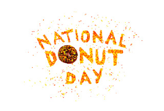
differently: I created my layout, then got an actual donut and sprinkles and shaped them into what I wanted for the card, which took some extra time to do before and after school.
Right off the bat, I messed up, thinking that we could just make a sketch and upload it into the computer to edit; most of my editing was in Illustrator, but the main thing about this project was to get all the details done on paper. For this card, I was going to do Pride Month, but since I messed up so bad, I changed my mind and decided to do National Donut Day instead.
During this project, I learned that it really takes a lot of work to be able to do hand typography well, and that even when you think something is done, it's not. Photoshop also helped me to learn that lighting is always very important when it comes to holiday cards with photos on them.
The feedback I got on my sketch was pretty well, but I got a lot of criticism for the photos I took of the donut. The lighting was always too bright/dark, the kerning of the sprinkle letters was off, but overall people liked it!
About midway through this was when Mrs. Burdolski helped me to decide that photos, instead of vectors, would be better and way cooler looking. This was pretty much the only thing that really changed about my project, other than that first failure.
I think, other than the fact that I forgot to fix the kerning and some of the lighting, that this project went really well. I could have been a lot more attentive when it came to details like the ones mentioned above, but, to me, it seems like something that would actually show up at Hallmark.
Company Branding
 At the very beginning of this project, we had to write down any animal, any number, any mineral, and any two-letter combination. We then put all of these slips of paper in specific jars, and went around the room picking up random animals, numbers, minerals, and letter combos (I had a monkey, 420, iron, and AB). We then had to create a company that integrated all of these things into it, along with a logo, product, uniform, app thumbnail, interior, exterior, and stationary for that company. I ended up creating Human Faces, a primate sanctuary based in Amtali, Bangladesh, with its address being 420 Iron Drive.
This project took about two months to complete in all, having to create logo sketches and many layouts for all of the things above and uploading all of it to Behance.
The biggest challenge here, as I'm gonna keep talking about, was that it went on for so long and I was getting impatient and lazy with it. For as long as this project went on for, I learned that it's really crucial to not get lazy with what you're doing, even if it lasts a while. I constantly had to keep pushing myself to stay with the game and not let my work get sloppy.
I was proud of the feedback I got on this project, and especially so when it came to the logo sketches. I wasn't even really thinking about it when I made it, but the group I was with noticed that one of the logos I made looked like both a monkey and the profile of a person, so we were all freaking out about that (of course I chose that one lol).
There were only a few things that I ended up changing with this project, and they only really had to do with the stationary. All I really needed to do was add a little border to the envelope and letterhead to make it look really "organic." I also had to remove the lines I originally had on my letterhead, but that was no problem.
I really don't like how long it took to do this project; it seemed to drag on for forever. However, I think that all that time allowed me to really get picky about my project, which is what I like to do. I feel like my logo and the idea I came up with for my company were kind of boring, but I'm still happy about how things turned out.
At the very beginning of this project, we had to write down any animal, any number, any mineral, and any two-letter combination. We then put all of these slips of paper in specific jars, and went around the room picking up random animals, numbers, minerals, and letter combos (I had a monkey, 420, iron, and AB). We then had to create a company that integrated all of these things into it, along with a logo, product, uniform, app thumbnail, interior, exterior, and stationary for that company. I ended up creating Human Faces, a primate sanctuary based in Amtali, Bangladesh, with its address being 420 Iron Drive.
This project took about two months to complete in all, having to create logo sketches and many layouts for all of the things above and uploading all of it to Behance.
The biggest challenge here, as I'm gonna keep talking about, was that it went on for so long and I was getting impatient and lazy with it. For as long as this project went on for, I learned that it's really crucial to not get lazy with what you're doing, even if it lasts a while. I constantly had to keep pushing myself to stay with the game and not let my work get sloppy.
I was proud of the feedback I got on this project, and especially so when it came to the logo sketches. I wasn't even really thinking about it when I made it, but the group I was with noticed that one of the logos I made looked like both a monkey and the profile of a person, so we were all freaking out about that (of course I chose that one lol).
There were only a few things that I ended up changing with this project, and they only really had to do with the stationary. All I really needed to do was add a little border to the envelope and letterhead to make it look really "organic." I also had to remove the lines I originally had on my letterhead, but that was no problem.
I really don't like how long it took to do this project; it seemed to drag on for forever. However, I think that all that time allowed me to really get picky about my project, which is what I like to do. I feel like my logo and the idea I came up with for my company were kind of boring, but I'm still happy about how things turned out.
Time in Class
Most of the time, I thought I was pretty productive. I would sometimes get distracted watching videos or looking up that weird theory that people have about Avril Lavigne, but I got just about everything done on time (I get very stressed if I don't).
If I got done with something early in class or had nothing really specific to work on [that was graphic design related], I would usually work on the t-shirt project for Girls Who Code Club or try to get caught up on my outside vector portrait of Academy Award nominee Rooney Mara. I also wanted to learn how to do shading in Illustrator, so I did a bit of research on that, too.
Illustrator is a lot of fun to work with, so sometimes at home I like to mess around with it and see what kinds of things it has, and if there's something there that I haven't learned (but would like to) yet.
Strengths
I'm very detail-oriented when it comes to design, so I try my best to not make anything look poorly made. I also often try to see if there's any variations I could do on some portions of my projects to make them look better.
Improvements
Unfortunately, being detail-oriented is also a bad thing, since it makes my design process very slow. I have been a very slow worker my whole life, so I think that in order to get better as a designer, I need to learn to work faster without sacrificing the beauty in my project.
Summary
I really love being able to have graphic design for two whole hours!! Even though it's a bit of a stressful work environment, I'd still rather be designing something than taking notes in other classes (the way the room looks also helps, along with being able to sit next to my girlfriend ◕‿◕✿).
Of course, if I could change how fast things go in this class and some of the projects we work on, I would, but I don't think that's gonna happen anytime soon haha. I know we're being prepared for the graphic design world, but I just really like being able to work on projects like the ones I work on outside of class.
Most of what I learned this semester had to do with time management, as I'm a pretty slow worker, and really had to keep things going in order to keep up with people (but not the Kardashians).
Next semester, I would like to not be as easily distractible, as it happens a lot. Also, again, I would like to teach myself to be a faster (but not lazier) worker.
Lastly, even though this has nothing to do with what I'm talking about, I'd like to thank Mrs. Burdolski for being such a great teacher (I'm totally not trying to suck up)!!
- Brenna (っ• ◡•)っ
 Our goal for this project was to create a company based on factors that other people in our class decided for us, and I created a primate sanctuary from it. It took a few months to make, and I had a bit of a hard time figuring out what I would use for my logo, but after that it was a pretty smooth ride. People loved one logo that looked like both a monkey and a human, so that was what I used. I really like how it turned out. However, I had to learn a lot about using Photoshop to edit the lighting of a picture, since I had to use it to put monkeys in a picture.


