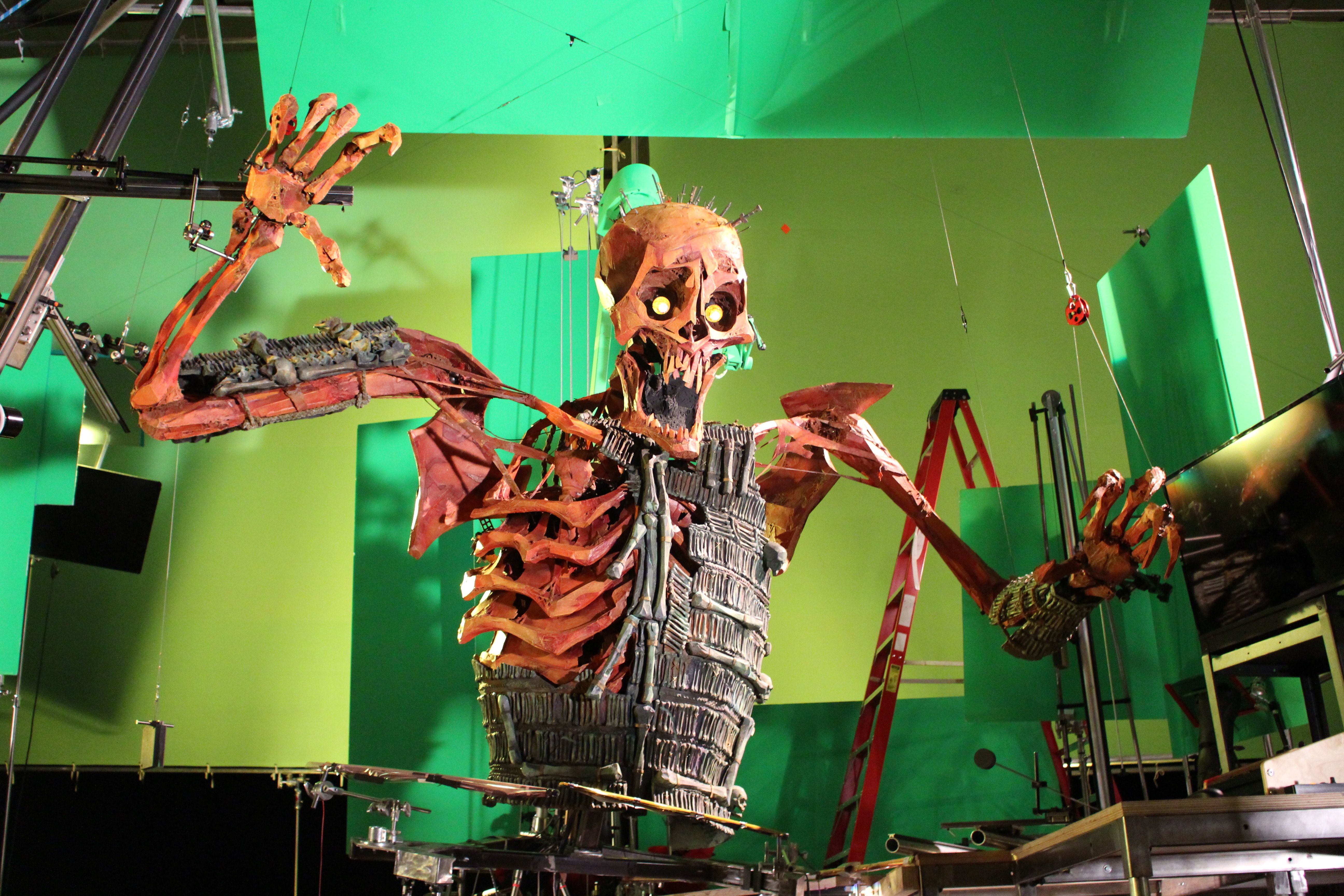
Tuesday, May 9, 2017

Godzilla Goes to McDonald's

The Scope
This, I'm pretty sure, is our final project. For this, we were put into randomly generated groups to come up with a short story to create using VFX and some of the concepts we learned throughout our year in animation.

Production

My team started off filming the scene where Godzilla (Ashlee) is taking the food from the worker (Josh). The rest was just making models in Maya, which was what I was doing for a lot of the time. After all the models were made, I created the title card using Illustrator. After a LONG time, everything was done, and Gabe and James put it all together in After Effects.


If Things Had Been Different
I know it's not something that I did, but I wish Rowan had decided to make the spaceships in Maya, since it would have been a lot easier to combine everything into one Maya file. That's my only real criticism, but he did do a really, really good job when it came to making them.
Oh, I guess another one would be that we didn't follow the storyboard at all (and I didn't know about it)??? So...maybe we should've followed the storyboard?? There were also so many editing errors made in the story (that I didn't know about) that I don't care to mention them all.

Same Things
I mean, I thought it was pretty funny, and so did everyone else, so I guess I'd keep the humor aspects in it. I also think that the greenscreen effects were dealt with pretty well, even if we couldn't exactly get our hands on believable costumes.

Making Future Projects Better
TALKING TO EACH OTHER MORE IN THE GROUP WOULD HAVE BEEN VERY HELPFUL!! You know, just so everyone knows what's happening!! We should have done that more often. :>

The End
All and all, this project was pretty fun to make (and watch), even if it was made pretty poorly. I don't regret it!


- Brenna (っ• ◡•)っ

Friday, May 5, 2017

"Wonder Garden"

Please Watch Before Reading!


Overview
'Wonder Garden' is about a young girl who is transported to a magical world by a teddy bear.

Design Principles
We haven't done actual frame-by-frame drawings in animation, so I wouldn't really be able to critique on that part. However, it looks very well drawn, nicely planned out, and not to mention reminds me of Ghibli.
In-Depth Look
Told from a 3rd person perspective, it tells the story of a girl who sees a teddy bear in a storefront who gives her a beautiful outfit. She and the bear start flying around with other teddy bears to a dark part of the city where a window is, and a huge mechanical teddy bear takes off its head and starts smashing it, freeing everyone. It goes back to the girl, now in her regular clothes, looking at the storefront.
Applications to e-Comm
I love the color palettes they use in this short film, like with the storefront outfit and the magic thing that the bear does in this screenshot. →
Someday I might use some of those color palettes in a graphic design project or something.

Learned Elements
In this same scene (that the screenshot is from), all of the spheres (whatever they are) are moving upward at different speeds, which we learned how to do in Maya a few months ago with our snowflake project. We also learned how to control how far away the surroundings are with a project we did last semester, where we had to create a scenery and make them seem farther and closer away (this happens in the short film).
Well Done!
I don't think there's really anything I dislike about this; the animation looks clean, it's cute, everything is timed nicely, and, again, it reminds me of Ghibli movies (especially when there's a gust of wind).
Improvements
I'd like to see an extended version of this, with an actual story behind the bears and everything that's happening (and why it's happening). Other than that, I don't think any improvements could be made.
Conclusion
All in all, there was almost nothing bad about this film, other than the fact that it left me wanting more.


- Brenna (っ• ◡•)っ


Wonder Garden. Dir. Yojiro Arai. Prod. Yoichi Kawakumi. YouTube. Spiral Cute Inc., 18 Oct. 2013. Web. 10 Mar. 2017.

Tuesday, March 21, 2017

Marks/Symbols

Article Summary
All in all, logos/symbols/marks/etc. have to be pretty compact, and yet easily recognizable; everything in it has to work well together, too.

Symbol or Logo?
A lot of people get these two confused; a symbol is a picture used to identify an organization, etc., while a logo only has to do with the actual name of it. Logos use type, symbols use graphics. When you combine these two, you get a combination mark!

What I Learned
Before reading this "article", I actually learned what I explained in the previous paragraph, that a logo and a symbol aren't the same thing. If I hadn't learned that, that probably would have caused a lot of confusion in the future. I also didn't know that Gestalt principles were used in graphic design ("close gestalt" and "open gestalt") in order to serve "as a magnet for the eye".

Picking Favorites
I feel like I'm being really repetitive with this, but believe it or not, my favorite thing that I got out of this article was that *gasp* logos and symbols aren't the same thing!!!!! No way!!!!!!! I already explained why it was valuable!!!!!!!!!!

All Together Now
Articles are usually pretty lengthy for me to read, even if this one was only two pages. However, most of what I learned from it was pretty important (like what I mentioned in the paragraphs above :> ).

- Brenna (っ• ◡•)っ

Thursday, March 9, 2017

Making 'Kubo and the Two Strings'

Main Idea
Generally, this article briefly describes several aspects of the creation of the movie 'Kubo and the Two Strings', such as making the puppets their clothing.

Author's Feelings
You can already tell how Giardina, the author, feels about the process just by reading the first paragraph. It's very obvious that she believes the process to be—and it is—extremely difficult, especially when she compares moving a single finger to preparations for a lunar launch. She doesn't seem to have any negative feelings towards it—she seems absolutely fascinated.

But Does She Actually Support This...?
YES. She does support this. Heavily. Giardina doesn't necessarily cite any particular documents/videos/etc., but she does describe many of the efforts it took to create the movie, such as carefully designing clothes for 9-inch tall figurines, printing thousands of different faces for multiple characters, and doing a seemingly endless amount of research to get the feel of the movie just right.

Strengths/Weaknesses

According to the Visual Effects Society, Carolyn Giardina has been writing articles for topics like this for over 15 years, which explains why I think she does such a good job of thoroughly explaining what all went in to this film. However, the ending of the article didn't really seem like much of a conclusion; it just kind of stopped. I wish she would have ended it in a better fashion.

Giardina's Conclusion (If It Was One)
As said in the last paragraph, she didn't really give a conclusion. The article just ended with her talking about the individual pieces of material that made the clothing for the Sisters. So...it wasn't that great (imo).

Significance of the Main Points

Most of what the writer talked about seemed like they're pretty significant, excluding little side stories, even though they were informative. Her main claim was that the set of this movie was much more "advanced" than previous stop-motion films, and easily supported that with multiple references to the small portions that made up the whole of the movie.

But Does Her Argument Support the Main Points...?
Please read the surrounding paragraphs.

Convincing Evidence
Yes yes yes yes yes yes yes yes yes yes yesssssss! She uses more than enough evidence! She convinced me in the second paragraph!! I don't think I have to say any more!!!!! ❤

Connecting It to E-Comm
Being in (and doing this for) animation, this makes me realize that even if it takes a really, really long time to work on something, and it's super frustrating, I need to keep working on it for the final product. The people at Laika worked on 'Kubo' for about two years, and it ended up being one of my favorite movies. It can basically be summed up by the VFX (visual effects) supervisor of the movie, Steve Emerson, when he said, "Making this movie wore me out. I can't wait to do another."

Here's What I Didn't Understand...
There were a few words I didn't know the meaning of in the article (i.e. "verbose"), but I was able sort of figure out what was being said using context clues and knowledge of what happens within the movie.
That wasn't such a big deal for me, but I wish she would say a little more about this "Shannon Tindle" that she mentioned, who apparently came up with the concept of 'Kubo'.

To Finish Things Off,

I could not agree more with this lady!! Not only do the creators of this film say it was extremely difficult to make, but 'Kubo' just looks so well made that it's almost impossible to disagree.

- Brenna (っ• ◡•)っ

"Carolyn Giardina." Visual Effects Society. N.p., n.d. Web. 09 Mar. 2017.

Giardina, Carolyn. "How 'Kubo and the Two Strings' Merged Stop-Motion Animation and 3D Printing (Plus a 400-Pound Puppet)." The Hollywood Reporter. N.p., 15 Dec. 2016. Web. 09 Jan. 2017.

Thursday, January 19, 2017

Posters!!!

Overview
Posters, viewed in the way consumers see it (not posters that you hang in your room), basically reflect the economic, social, cultural, and political state of everyday life. They can also suggest, unveil or remind the viewer of their personal "wishes". Most of all, a poster should inform its audience in stimulative way so that it is not forgotten and it is possibly dispersed to others. Today, posters have become common enough to the point that we see them everywhere.

Follow the Rules
The laws of designing a poster, as boring as they may sound, can actually make your product more noticeable to a passerby. Supposedly, it isn't very often that people stop to look at a poster, probably because they didn't "follow the rules". There are many factors in this, including:

  • Color
  • Proportion
  • Contrast
  • Rhythm
  • Form
  • etc.
The factor "color" can have multiple meanings; it can create a specific mood, "clarify situations", and is especially recognizable when having to do with politics (Democrat, Republican, etc).
Another factor, "lettering", is very important, but not as much as "color" might have. The fundamentals of this element incorporate its size, legibility [from a distance], and style.
Lastly, there's "shape", another one of the most significant principles of poster design. Some of its effects on the overall product include the shape being large in size, but not too dominating, obvious from a distance, "forceful presentation" to catch someone's attention, clarity, visual appeal, overlapping with other elements of the poster, and a dynamic display. Like other functions of the "laws", it won't work correctly if used improperly.

Key Points
The three main points I believe this article is trying to get across is that most posters aren't as publicly tasteful as they could be, they should be made to pop out, and most importantly, they recognize situation that are happening in real life. The first two are prominent because they both attempt to get the reader to not follow the crowd with boring posters, but make them influential in your own way. As for the last one, you may be so used to what's happening in the real world that you don't realize how important it is until you see it reflected on a poster.

Valuable Aspects
To me, the most interesting thing I read from this article was that, as said in the previous paragraph, there aren't many posters that strike people's aesthetics like there might have been before. By keeping this in mind, I will try my best to make my projects more optically appealing and study successful posters in the hopes of having the same effects of them.

Dumbed Down
In conclusion, posters are important and should be made with care.

- Brenna (っ• ◡•)っ

Friday, December 16, 2016

Semester Reflection - Graphic Design

Semester in Review

  •  Raccoon
    • This project took us a few weeks, but not too many. For it, we created a raccoon using a tutorial (through it, we learned the basics of Illustrator), and afterwards put it in a "fall picture" (mine didn't look very good) and a postcard. A huge setback for me during this project was that we also had to put some fall leaves in our fall picture, but I had the idea that we had to make all the leaves in the tutorial when we actually just had to make a few. However, I'm pretty proud of the postcard I made; it was around Halloween time when we made ours, so I gave mine a Halloween theme. I never got any feedback for my fall raccoon, but I did receive some compliments on my postcard. :> I didn't really like these projects as much as the ones we did later on, since we weren't able to be as creative with them.

  •  Vector Portrait
    • Our second project was creating vectorized portraits of ourselves in Illustrator. For me, this project, once again, took me longer than everyone else in making it. We had another few weeks to work on it, but I spent a great deal of time after school trying to make it more and more detailed. In the picture I was recreating, I had been wearing plaid, so I had to create a different shirt for the portrait so it wouldn't take as long. I don't ever remember getting feedback on it. My personal opinion on the finished portrait would be that it looks good and bad at the same time (good: lots of detail; bad: I'm really ugly).
  • Infographic
    • Out of all the projects we've done so far, this is the one I'm most proud of. Our assignment was to create an infographic based on something we're interested in, so for mine, I chose the ISS because of my dream to someday go to space. I know I'm being repetitive, but again, I don't know how long we had to work on these; I know it was at least a month. In the beginning, we mainly had to do a bunch of research, but I decided to do my graphics first, which set me back later when I had to do a ton of research. During the process of making it, I received a bit of critique from some of the "full-time" graphic design students, in which they recommended that the bar of information to the side have a background that complimented the rest of the image, soooo that's what I did. I think my infographic turned out pretty well, but maybe just a little too crowded in some areas. I spent several hours after school working on this and, even though it was very tiring, I love the final result.

Time Well Spent
Because of the fact that I'm super awkward when talking to people (and therefore almost never talk), I think I'm pretty good in terms of managing my time.
When I completed my work, some things I would do to utilize my time would be to: go through Behance, work on homework, or make other things in Illustrator.
To strengthen my work outside of class, I draw a lot and try to pay more attention to ads on television or anywhere else to see what professional graphic designers use in their work.

Strengths
I've always been pretty keen on art and design, so it wasn't hard at all for me to create visually appealing images and asking a few people if what I've made makes sense or not.

Areas of Improvement
Even though I can't really help that I'm a slow worker, I would like to become a faster worker and, as my brother says, "Work smarter, not harder." I'm sure that with enough time, I'll start to improve on that.

Overall Thoughts
As I said before, my favorite thing about this semester has been creating my ISS infographic, which I am so proud of. However, if I could go back in time to stop myself from doing something, I would tell myself not to make all the fall leaves (since no one else told me). I thoroughly enjoyed learning about all the tools in Illustrator, and I hope that next semester I can make something even more impressive than my infographic.


- Brenna (っ• ◡•)っ


Portfolio Reflection

Worm
I think this was our first or second project, and it was so long ago that I barely remember what we did. However, I do know that this was our first project involving the puppet pin tool. Using it, we learned how to make an otherwise immobile object move around without having to make any more versions of that character (if that makes sense??).
    We learned it through the directions, of course, but I still had a bit of difficulty when it came to actually animating it.
    My worm moves faster that it actually inches and it looks really weird, but it was one of my first animations so I'm sure it's fine.
    I love the worm I made (it's the one that destroyed Bikini Bottom), but for some reason this was a really hard project for me.


        Walk Cycle
        When we were all working on our walk cycle animations (for me, it was my sexy astronaut), I learned that you can animate characters that you draw [in separate parts] using programs like AfterEffects and how to make a character walk.

        I AM SO PROUD OF THIS!!! I love almost everything about it!! The only thing I'm not proud of is the fact that I couldn't figure out how to use the pinpoint tool, so it looks like the astronaut is just marching across the screen instead of actually walking like a normal person.
        I assure you that I will be proud of this project even after I've been dead for millions of years. I know this is so stupid, but this was my favorite project from this semester.


          Scenery Animation

            I had never known that there were several layers of scenery used in old animated movies and cartoons to make the setting seem more realistic. We learned how to do just this: how to create a moving landscape.
            The bad thing about working in Photoshop (for me) is that I always forget to switch layers if I want to draw on one of them, and of course that happened here. I don't remember where this happened, though, since it was such a long time ago, but I can assure you it happened. I don't really like the stuff that moves across the background, but at least the clouds look nice.
            So far, this has been my second favorite project, only surpassed by the sexy astronaut, since it involved a lot of drawing and actually looks pretty nice compared to my other projects.

              Ice Cream
              When we made our ice cream, I wasn't really looking at the directions to figure out how to get the ice cream texture on my ice cream (I just went to Google Images instead), so that was kind of a lost opportunity. However, I did learn how to use the timeline in Maya and how to rotate objects for the timeline.
              I learned this by constantly asking for help with things I should have been able to figure out on my own, but I'm stupid lol. I also got some of the directions...from the directions (surprise!).
              We did not pick this project, it was assigned to the class. However, we did get to put a bit of creativity into the project by coloring our ice cream however we wanted, and by making our own ice cream "shops" (they were more like rooms than shops).
              Sadly, I'm one of those people who has a lot of trouble finding things that are right in front of them, so I kept having to ask people where certain tools would be found and I'm sorry to them. I also couldn't figure out how to get the shadows to show up, even though I know how to now. BUT I did do a good job with color scheme and making things look nice, I think.
              Literally the only thing I would change about this would be to add shadows.
              This was kind of an in between project for me; it wasn't really hard, but it wasn't really easy.


              Pen


              For this project, we had to create a pen that we owned in Maya, so we had to do a lot by scale. I constantly had to hold the pen up to my screen to make sure it was the right size. From this, I learned how to scale things properly and, additionally, how to create new vertices using the "Insert Edge Loop" tool.
              I learned how to use the edge loop tool thanks to someone else who was having trouble in class; if he hadn't spoken up, I don't know if I would have ever learned how to do it. As for scaling properly, that just seems like common sense to me. It wouldn't make very much sense to make a pen that looks just like the actual pen, but shorter...or something like that.
              I didn't really have a choice in choosing this project or the pen that I ended up modeling. I mean, I'm really happy that it was a fairly simple pen, otherwise I'm sure I would have had wayyyy more trouble making it than I already did.
              I'm pretty proud of myself in the sense that if I didn't know what to do, I would either do it my own way or look it up instead of just complaining about it like I usually do. Although, I kept getting kind of angry when I couldn't even do that and asked people around me for help and they couldn't help me. Even though it wasn't their fault, I just couldn't help but get irritated when they could help someone else but not me. :<
              Maya, unsurprisingly, is a lot easier for me to use now than it was when I first started using it. I've learned a lot from it [and don't cry as much about it as I used to haha].
              Hopefully, if I every get Maya on my home computer, I will be inclined to make more objects like this and keep improving. Well...not really like this, but better things like dogs or something.
              I am very much a perfectionist, so it really bothered me when I had already made the thing on the end of the pen (where you push it and the point comes out at the top) because it was slightly larger than the actual one, and it still really bothers me. I would definitely change it if I could.

                This was probably one of the projects that I'm most proud of in this class, even if it was just making a pen. I think it looks a lot better than a lot of the other things I've made in this class! :>


                  - Brenna (っ• ◡•)っ